Understand the situation with a burndown chart
Overview
By displaying the planned times and remaining work hours on a daily basis in a graph, you can visualize not only the discrepancy between the plan and the actual results, but also the performance of your team.
Predict future progress from past work volume, making it easier to forecast the expected completion date and the amount of resources required.
Flexibly adjust your plan according to changes in progress.
Display the burndown chart
Display the Kanban on the work item screen and click the red frame in the image below.
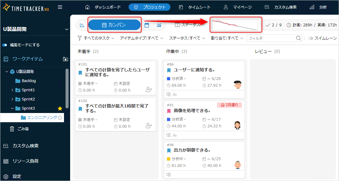
The following screen will be displayed.
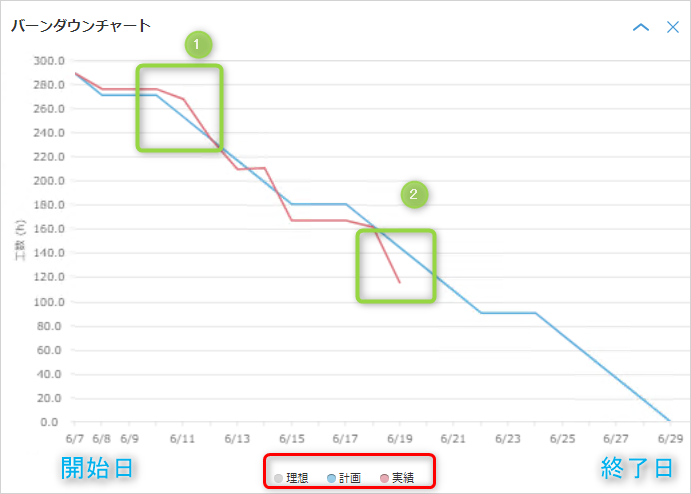
- The start date/end date is the information of the folder selected in the folder tree.
To switch the display, select the target in the folder tree. - Click the corresponding part in the red frame to display the following lines.
- Ideal: A line connecting the remaining work hours on the start date/end date, without considering non-working days.
- The start date is the total planned times, and the end date is 0.
- Plan: A line connecting the remaining work hours on the start date/end date, taking into account working days.
- Actual: The value of "remaining work hours" for each day.
- Ideal: A line connecting the remaining work hours on the start date/end date, without considering non-working days.
- The relationship between the planned line and the actual line shows whether there is a delay. (Green in the above image)
- ① Plan < Actual: Late.
- ② Plan > Actual: On track.
Displaying the performance line
The performance line shows the "remaining work time" of each item.
-
To display it automatically, set the remaining work time determination method to "Calculate from performance" (default determination method).
If you have set it to another determination method, please change it.You can change the remaining time determination method for all items in the project at once by using the method at the link.
"Setting the default method for determining remaining work time" -
You can display it in the Gantt table using the following method.
"Changing the contents of a table you have already created"