Display as a Graph
Overview
You can display the output results of the analysis report as a graph.
Graphs come in multiple variations, including bar, line, and pie charts.
Switch between them according to the perspective you want to analyze and efficiently visualize the facts.
Displaying Charts
Click "Show Chart" (①) on the Home tab.
This displays the selected range in the report as a chart (②).
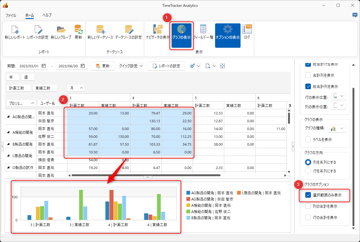
If you want to chart the entire report, uncheck "Show Selection Only" (③).
Chart Display Options
Click "Show Options" on the Home tab.
You can operate the following:
- Chart Display: Switches between chart types (①) and displaying labels (②).
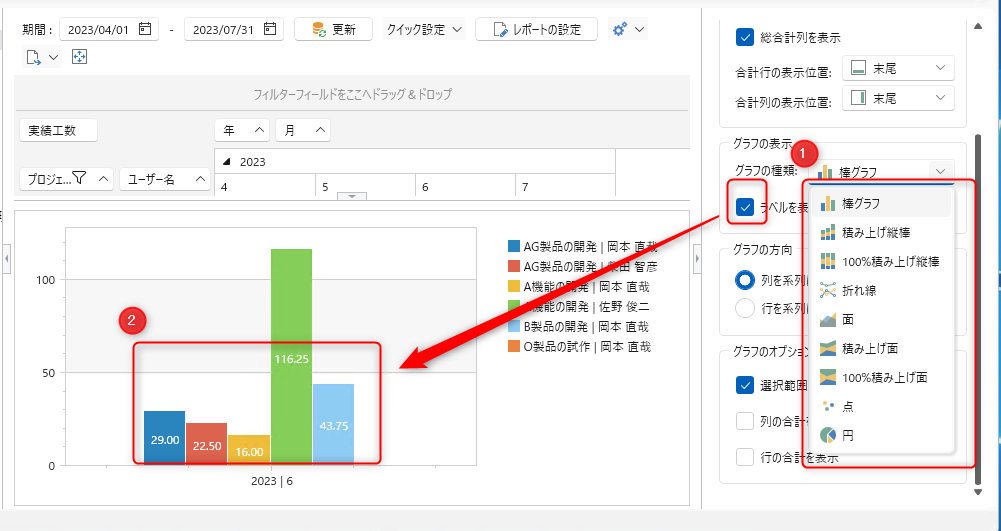
- Chart Direction: Select the series as shown below.

If you select "Rows," the light blue cells will represent the series.
- Graph Options: Select the display range.
External Output of Graphs
The displayed graph can be copied to the clipboard by selecting "Copy Graph" using the following methods:
-
Select the graph and right-click.
-
Select from the options at the top of the report.
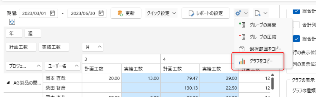
You can output the graph to any file, such as Excel.