What is pivot analysis?
Overview
Pivot analysis can aggregate data accumulated in TimeTracker RX, such as labor hours and costs, across projects and organizations.
- You can freely set the axis to be aggregated and easily display the data to be analyzed.
- You can instantly switch from project-based man-hours per member to project-based man-hours per member by swapping projects and members, and
- You can freely change your perspective while analyzing.
It can be used for the following purposes.
- Analyze the planned and actual times and costs for each member in an organization by month.
- Deepen the breakdown of members by project.
- Aggregate man-hours and costs by project item.
Note that you do not need to set the settings every time, and you can always use the same aggregation method.
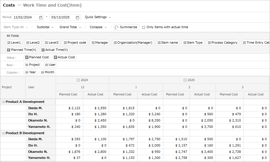
By displaying the planned and actual costs for each project side by side in a table format like Excel,
you can easily check the profitability of each project.
The figure below shows an example of monthly planned and actual costs for each project.
We will explain the functions related to pivot analysis.
How to use the pivot analysis function
The aggregated data is displayed in a table format like Excel, and you can achieve the following.
- You can freely set projects, accounts, years, months, etc. as rows and columns with aggregation axes.
- You can easily change the displayed content by changing the row and column settings.
The structure of the pivot analysis screen is as shown in the figure below.
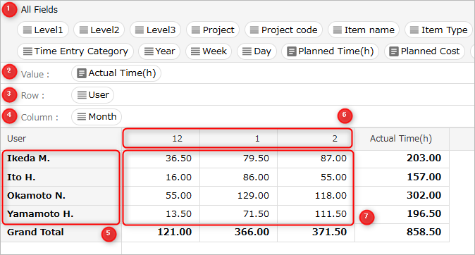
①: A list of fields available in pivot analysis.
②: This is where you set the fields to be aggregated.
③: This is where you set the fields in the rows of the aggregation axis.
④: This is where you set a field in the column of the aggregation axis.
⑤: Displays the data of field ③ set in the row.
⑥: Displays the data of field ④ set in the column.
⑦: Displays the data of the aggregated field ②.
To set a field in each location, drag and drop the target field.
To remove a field set in each location, drag and drop the target field to "All Fields".
Example of view settings
-
Displays the actual times for each user by month.
Setting items: Row "User", Column "Month", Value "Actual labor hours"
-
Aggregate the actual costs for each project.
Setting item: Row "Project", Value "Actual Cost"
-
Aggregate by hierarchy.
Setting item: Row "Project", "User"
Settings such as target data to be aggregated and aggregation axis are saved as a view.
-
Multiple views can be created, and by saving them, you can always refer to the same aggregation method.
-
Created views can be grouped according to the content to be analyzed, etc., to make them easier to use and customize.
By switching the view selection, you can easily display the desired aggregate data at any time.
-
Organize the "Effort Summary" group by setting views for "By Account" and "By Project".


Display the Pivot Analysis Screen
To use pivot analysis, display the pivot analysis screen by following the steps below.
-
Click "Analysis" in the global navigation.

-
Click "Pivot Analysis" in the local navigation.
Please refer to the following link for the actual setting method: "Setting method"