Analyzing Man-Hours
Overview
Quick Report is a system that visualizes man-hour data on timesheets in real time.
- The graphed actual man-hours are linked to the actual man-hours displayed on the input screen, and the display color is linked, so
You can see at a glance "which project," "which task," "when," and "how much time was spent" on each - By easily reviewing your work content while inputting man-hours,
you can identify inefficiencies, waste, and inconsistencies, and use this information for improvement.
There are two types of Quick Reports, which you can use according to your purpose.
- Built-in Report
- Outputs data using pre-defined aggregation axes, such as "Projects with high man-hours."
- Ready to use whenever you need it.
- Custom Report
- Set the man-hours to be aggregated independently, allowing you to aggregate the man-hours you want to analyze.
- For example, man-hours for specific characteristics such as "interruption work."
- Multiple reports can be created and used according to your purpose.
- Set the man-hours to be aggregated independently, allowing you to aggregate the man-hours you want to analyze.
Here, we will introduce the following regarding the use of built-in reports.
For custom reports, please refer to the following link: "Analyze from your own perspective"
How to view Quick Reports
Quick reports display the following:
- Man-hours aggregated by group, which is the man-hour aggregation item.
- The ratio of that man-hour (displayed as a pie chart)
This allows you to:
- Check the specific man-hour values for each group and their proportion of the total.
- Analyze man-hours by switching between various types of reports.
- Specify the period for which man-hours are aggregated.
When you display a Quick Report, the color of the actuals on the timesheet changes to match the Quick Report.
By linking the colors of the actuals and the Quick Report, it becomes easier to visually grasp daily activities.
What you can do with Quick Report
The following can be done on the Quick Report screen:
| No. | Function | Description |
|---|---|---|
| 1 | Switch the report to display | Select the report to display on the screen from the list of available reports. |
| 2 | Specify the period for man-hour aggregation | Switch the period () for man-hour aggregation in Quick Report. Period displayed in the timesheet/Today/1 month/Arbitrary period |
| 3 | Display man-hour aggregation results by group | Displays the following: - Items (groups) for which man-hours are aggregated - Aggregated man-hours - Displays the conditions set for the group. You can also toggle the display of the toolbar on the screen. |
| 4 | Display a graph | Displays the man-hour aggregation results as a pie chart. |
| 5 | Add a custom report | Add a new custom report. Added custom reports can be reordered/configured. |
| 6 | Outputting Reports | The summary results of the Quick Report can be output in the following ways: - PDF file (comments can also be left on the summary results) - Clipboard output (can be pasted into other applications) |
Displaying Quick Reports
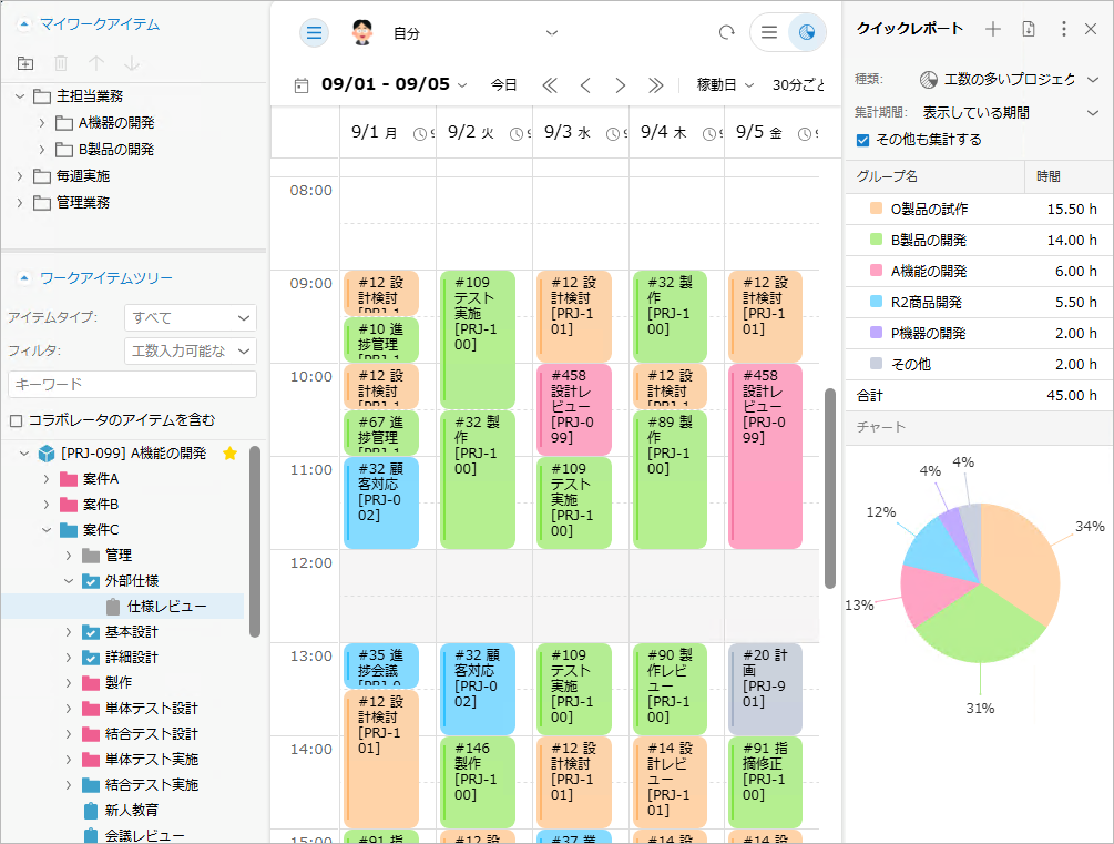
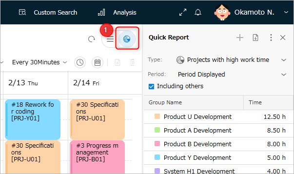
To display the Quick Report for the timesheet, click "Quick Report" ① in the upper right corner of the screen.
The entered actual man-hours will be immediately reflected in the Quick Report.
You can also hide the Quick Report by clicking again.
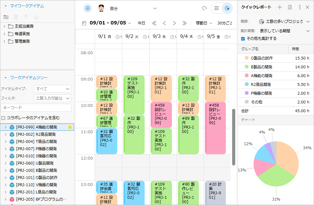
The image below shows the Quick Report type when set to "Projects with High Man-Hours".
- When actual man-hours are entered, the man-hours are recalculated, and the man-hour summary results and graph display are updated.
- You can immediately analyze what work was done in the target week using the Quick Report.
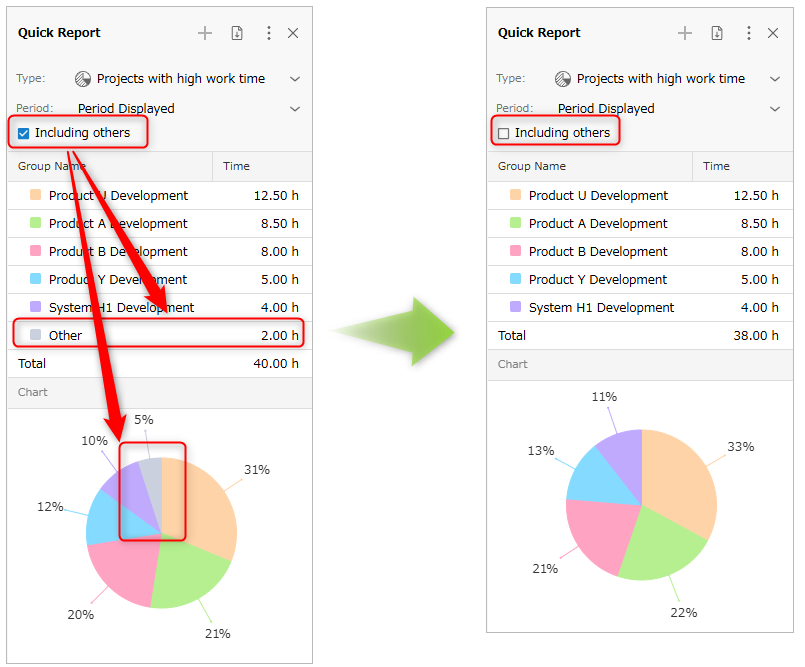
Items that don't fit into any of the categories in the Quick Report are classified as "Other."
You can toggle the display of "Other" with a single checkbox, allowing you to efficiently analyze only the items you want to analyze.
Switching Report Types
The Quick Report allows you to switch the reports displayed.
By switching to the report that suits your purpose, you can quickly perform appropriate effort analysis.
- How to switch the display of the Quick Report
- Select the type of report you want to display from the "Type" list.
- The display of the Quick Report switches each time you select a report type.
By displaying "Projects with High Effort" or "Work Items with High Effort" in the report type,
you can see at a glance where effort is being spent, and use it in the following ways:
- Verify that the workload is allocated according to the expected proportions.
- Use as reference material for weekly and monthly reports.
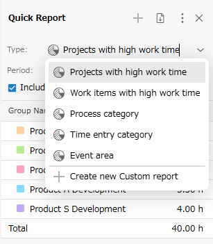
The report types are as follows:
Report Types
The pre-configured built-in report types are as follows:
Each report displays workload for the top 5 items with the most workload and for the remaining workload in the "Other" category.
| No. | Type | Actual Man-Hour Aggregation Unit | Usage Scenario |
|---|---|---|---|
| 1 | Projects with High Man-Hours | Project | To get a general understanding of your work content |
| 2 | Work Items with High Man-Hours | Work Items | To review your work content at the task level |
| 3 | Process Classification | Process Classification | -Aggregate your man-hours at a finer process level than tasks - Visualize the ratio of time invested in each process |
| 4 | Work Classification | Work Classification | -Aggregate work man-hours at a finer work unit than tasks - Easily review the work you specifically performed |
| 5 | Work Items in the Event Area | Work Items | To review whether you were able to spend time on the work you had planned for this week |
In addition to the reports introduced in the table, you can also display custom-defined reports to perform analysis tailored to your purpose.
For instructions on defining your own reports, please refer to the following link. : "Analyze from a Unique Perspective"
- Specify the period for man-hour aggregation
- Output a report
Changing the Aggregation Period
The aggregation period for Quick Reports can be specified not only for the displayed period but also for any period. This allows for the following uses:
- Aggregate man-hours for one month based on the closing date to use as a reference for attendance information.
- Review monthly activities by changing the aggregation period from weeks to months.
To change the aggregation period, select one of the following periods from the "Aggregation Period" dropdown list:
| No. | Item | Description |
|---|---|---|
| 1 | Displayed Period | Aggregates the actual data for the displayed period. The aggregation is updated to reflect the latest display in conjunction with changes to the displayed period. |
| 2 | Today | Aggregates the actual data for today only. |
| 3 | Month | This function aggregates data for the calendar month including the displayed period. If the displayed period spans across months, the previous month will be used for aggregation. |
| 4 | Specify Period | You can aggregate data for any period. The set period will be displayed in "Aggregation Period". |